Straddling tradition and modernity
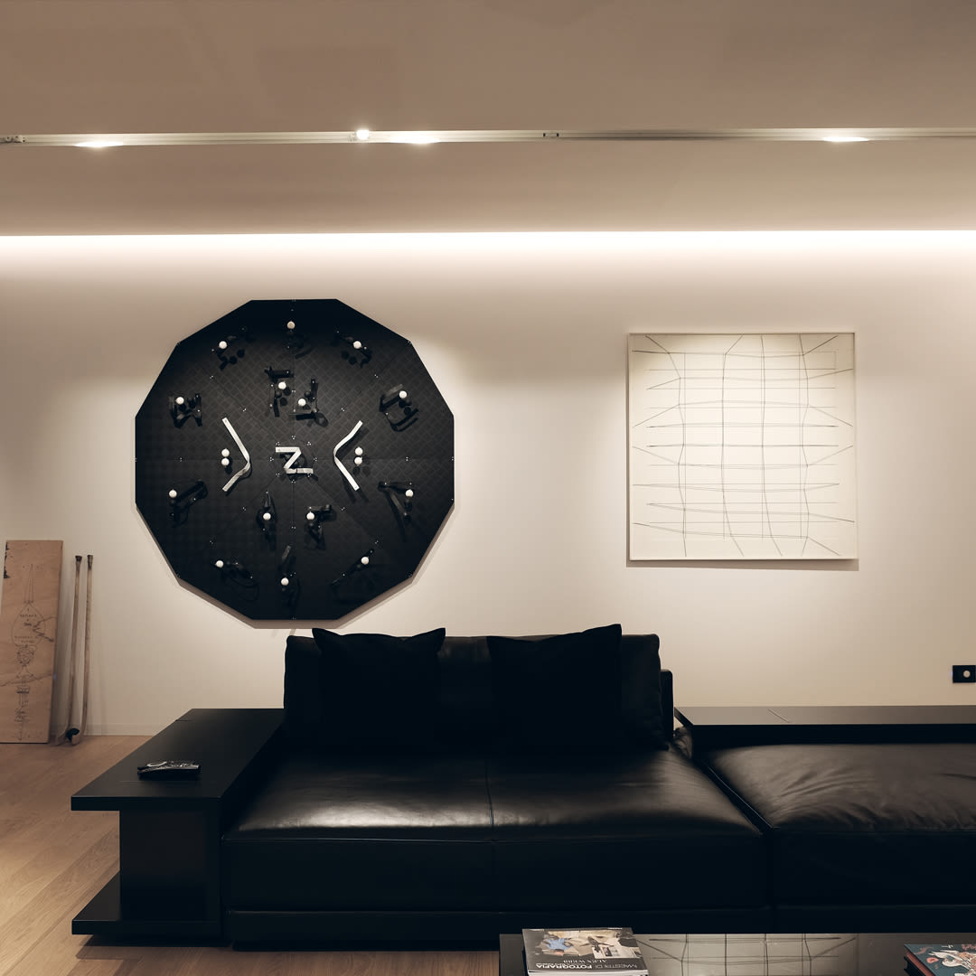
A construction that re-proposes the rules of rural architecture in the form of an 18th century farmhouse with a closed courtyard surrounded on three sides by buildings, a manor house positioned on the north side consisting of two rectangular bodies, both with masonry walls and on the west side a portico on pillars with lowered arches reinforced by columns. The roof is a gable roof with wooden load-bearing beams. All the characteristics tell the story of the architecture of a region, highlight the human effort and how it blends into a context made up of complex structures with a well-defined hierarchy of buildings. We were asked to develop an articulated project that included a new heating and plumbing system and the complete furnishing of the house, from the kitchen to the living room, the bathrooms, bedrooms and the study and the walk-in wardrobe. To meet the client's requirements, we developed a project by applying advanced technologies and quality materials and following a contemporary aesthetic expression of straight lines, pure volumes, essential surfaces and sophisticated details.
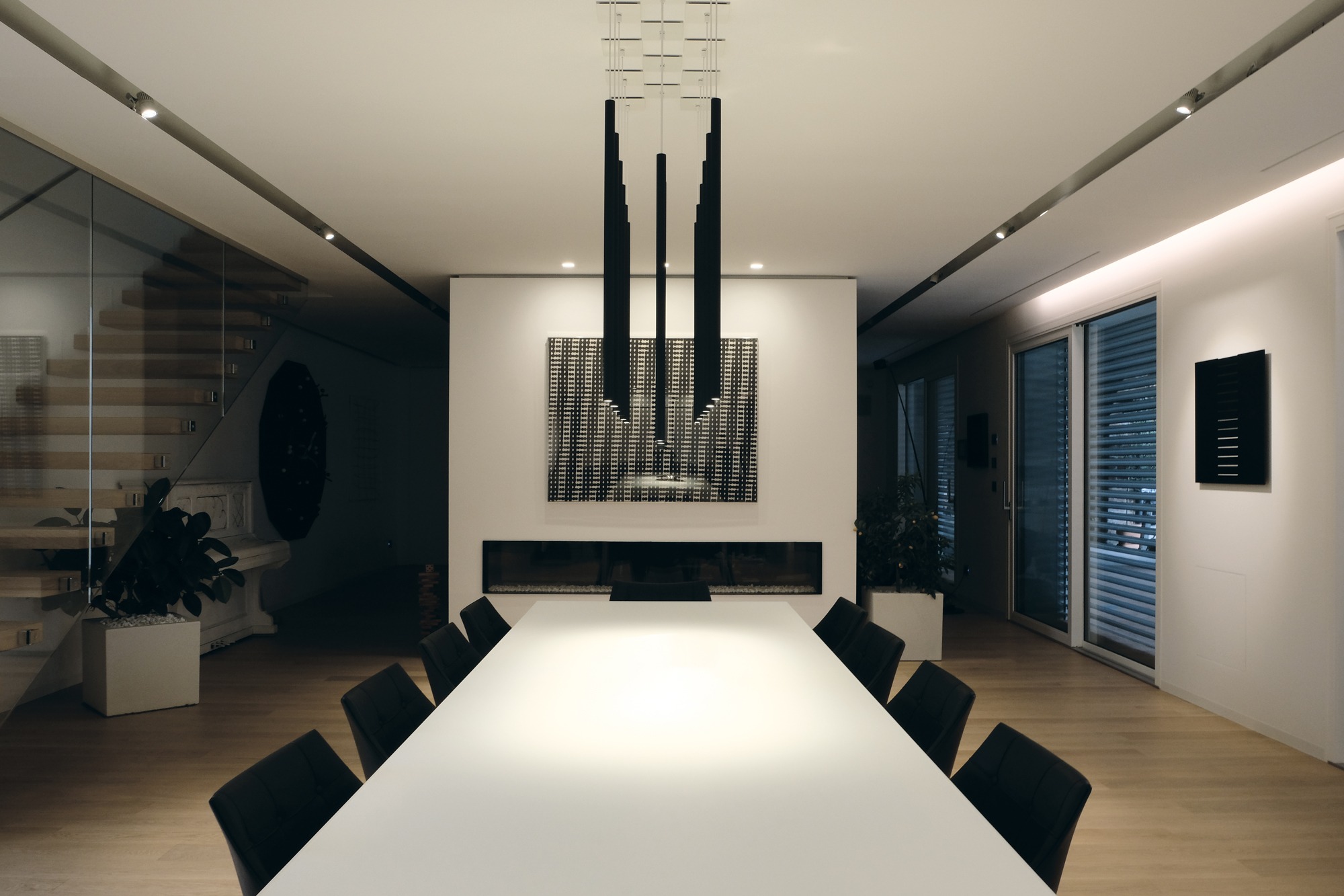
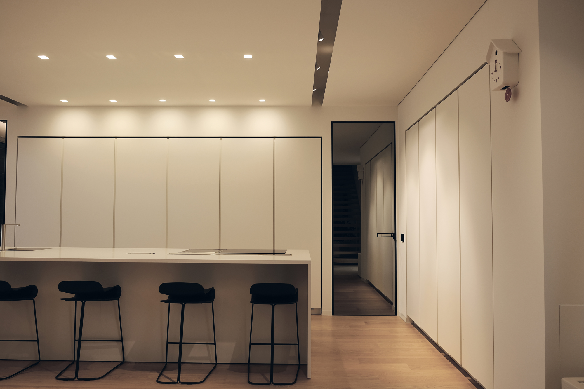
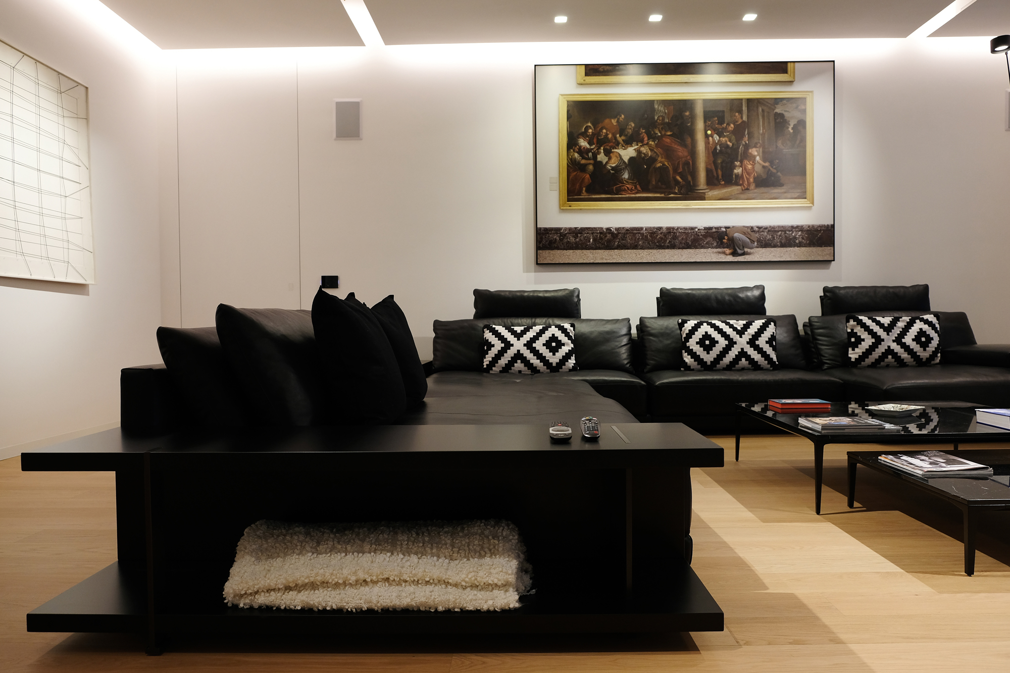
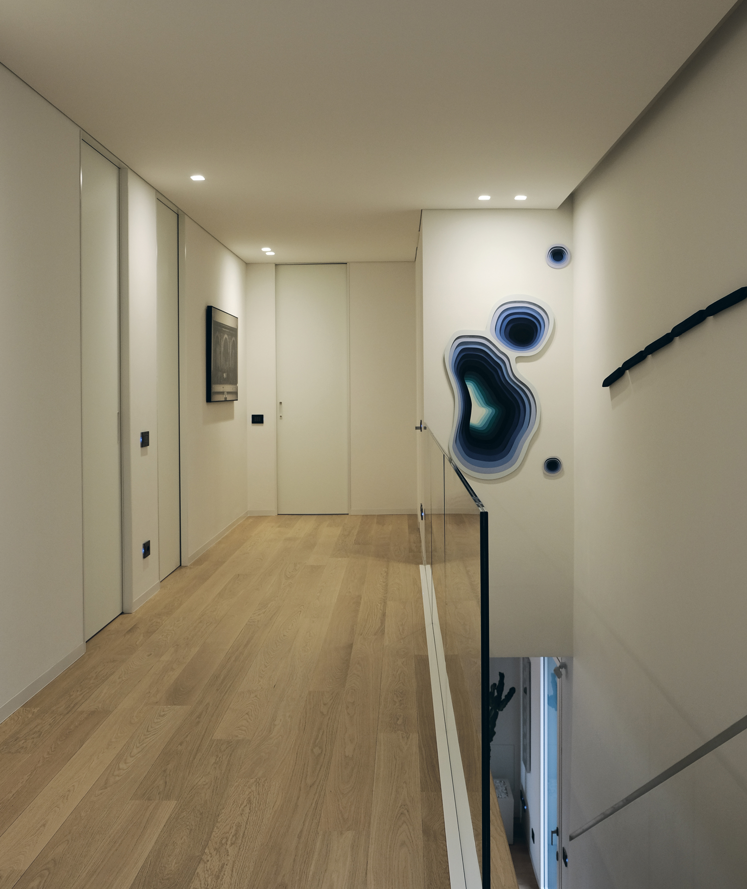
A balance of proportions, symmetrical order, rationalisation of flows, lines and colour coordination. These are some of the key features around which our whole project revolves. They are present in the most important, representative and convivial areas such as the living room and kitchen, and in the more private and intimate areas such as the bedrooms and bathrooms. An internal staircase in the living area with wooden steps and a transparent glass wall connects the two levels. In the kitchen, all white, completely smooth columns and storage units without protrusions or handles are completely integrated into and coplanar with the wall, while an island that houses the sink and hobs becomes a countertop for quick meals and breakfasts, taking center stage. In the dining room, a long Rimadesio table extends longitudinally into the room, defining its axis of perspective symmetry. In the living room, a large dark sofa with bookcases catches the eye inviting relaxation and conviviality.
The elegance and stylistic rigour of Rimadesio doors allow circulation areas to be "enlarged", blending perfectly into walls with their chromatic continuity and minimalism. Light, almost completely white tones, contrast with the warm colours of the parquet and the materiality of the wood. The rooms are cleverly lit thanks to a design that combines recessed spotlights in the ceiling with more aesthetic and formal solutions that make each room unique. Of the top brands, high-performance elements with a discreet presence were chosen from the Viabizzuno and davidegroppi collections, to ensure correct lighting in every corner of the house.
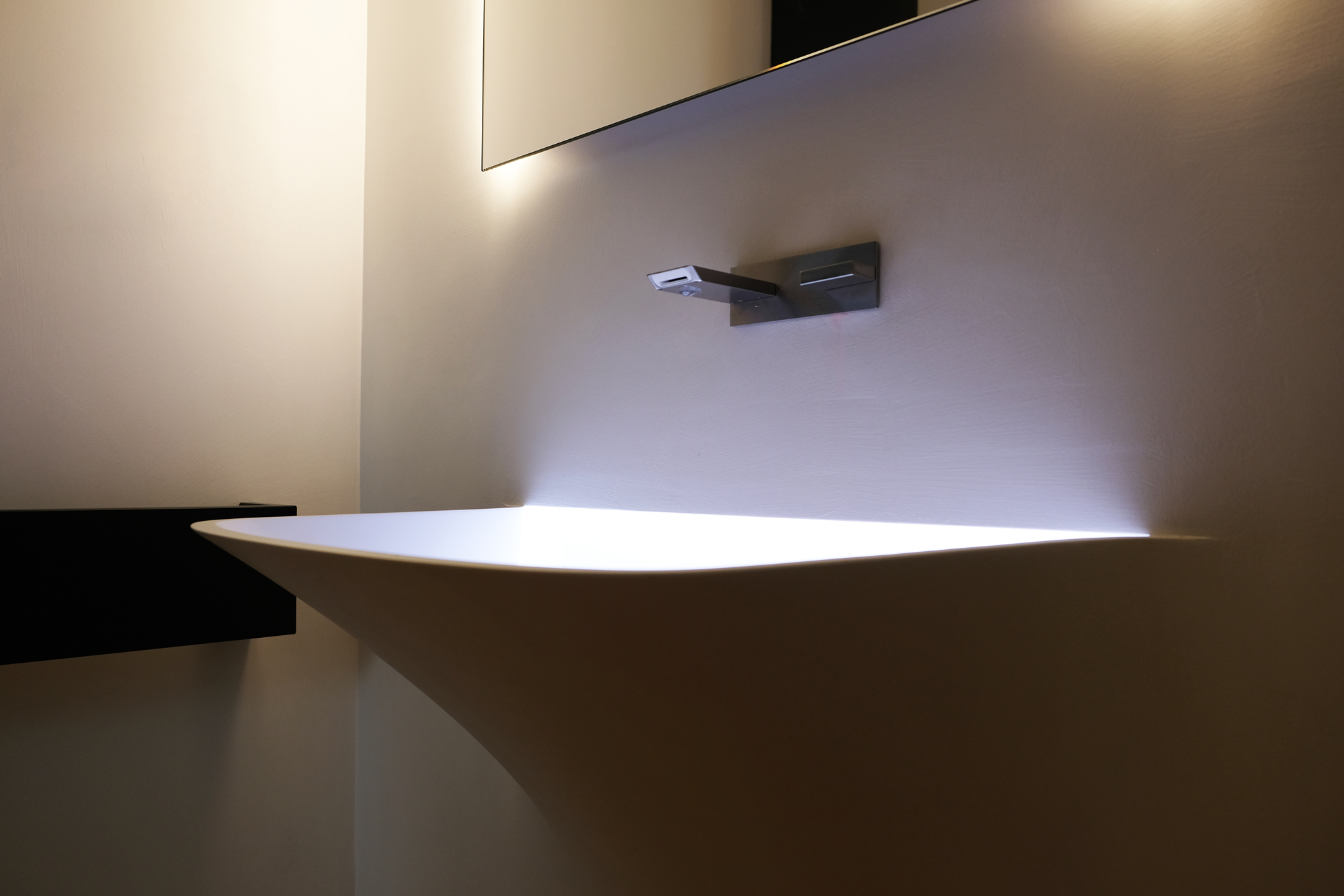
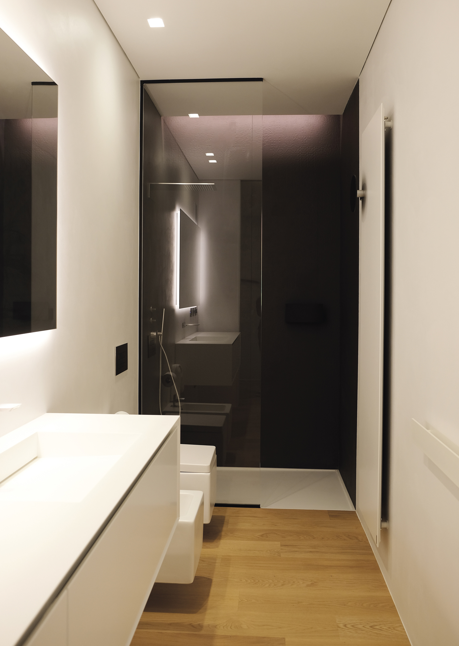
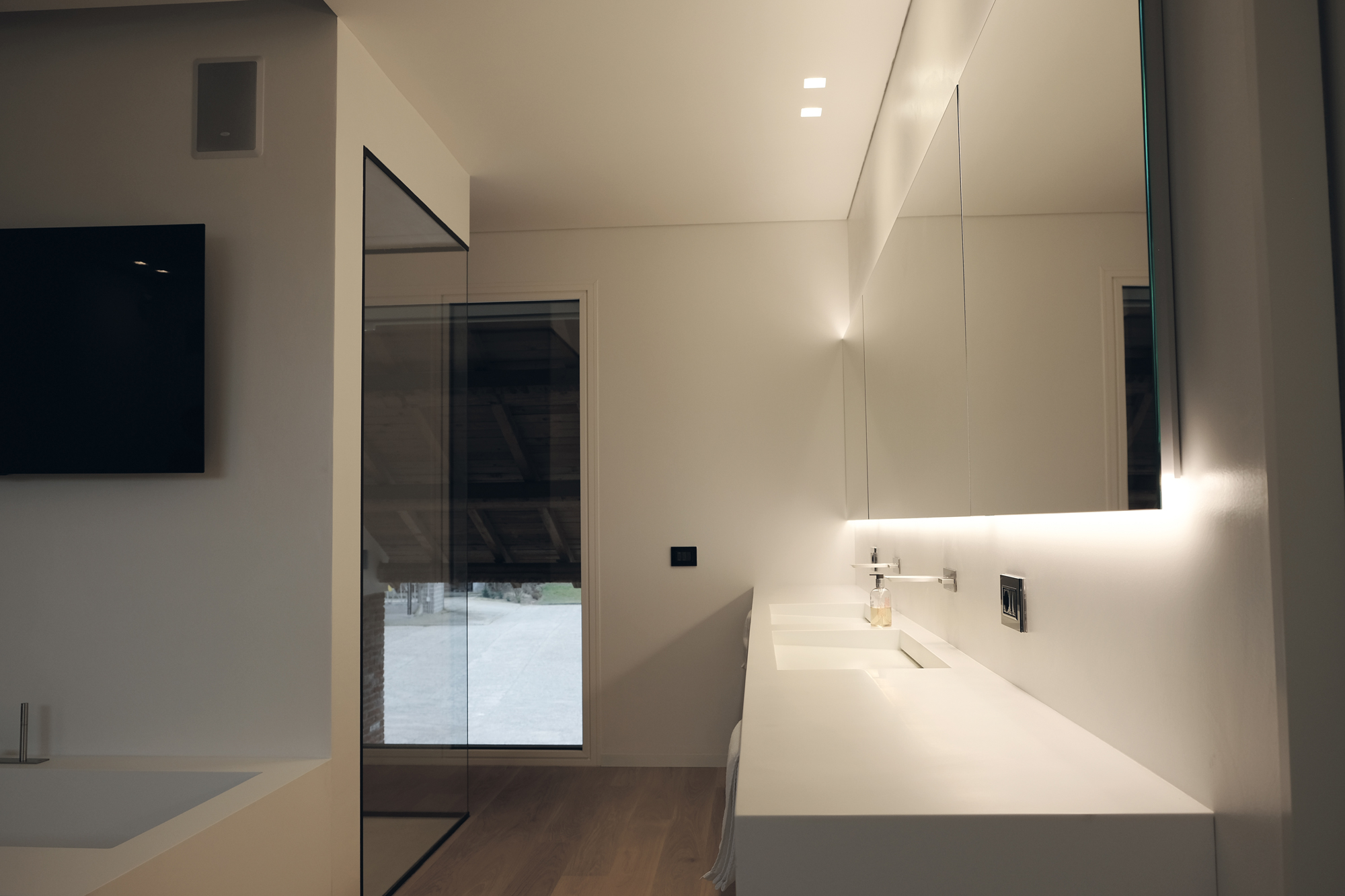
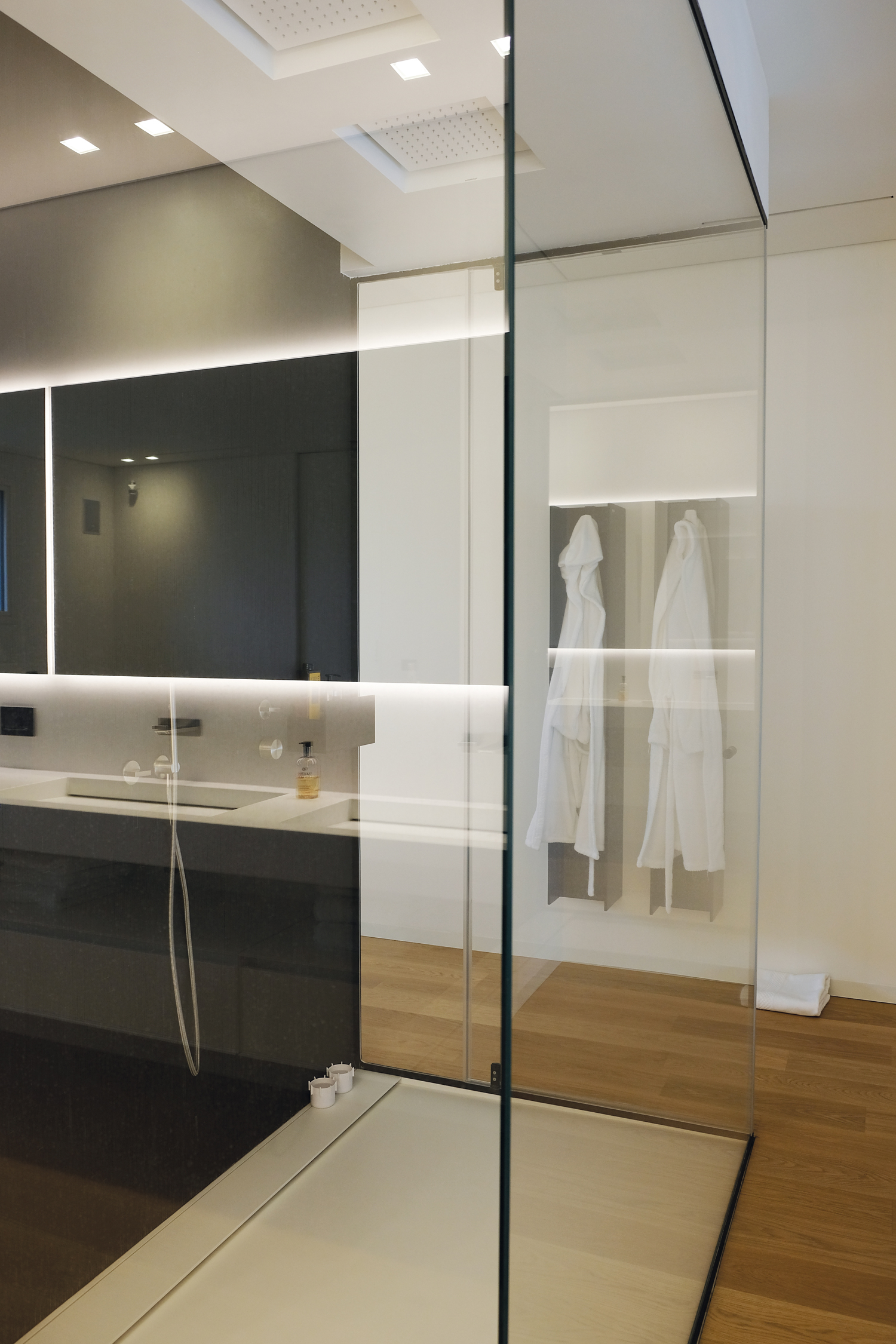
Aesthetics and performance reign in the bathroom as well, with tailor-made and customised solutions that create an oasis of relaxation and well-being. antoniolupi's Soffio washbasin has been placed in one of the bathrooms, attracting the eye with its shape that melts seamlessly into the wall from which it seems to have originated. A strong presence with an organic form is the only concession to an orthogonal minimalism that distinguishes sanitary ware, the shower area and radiators. The white of the ceramics and the walls, covered with resin from HD Surfaces contrasts with the darker tones of the shower area, clad with the refined Déchirer porcelain stoneware collection by Mutina, the light bas-reliefs of which serve as sophisticated decorations. In the large master bathroom, in addition to the shower, there is the pure, clear-cut volume of the Biblio bathtub by antoniolupi, customised on request, with a wide rim that serves as a practical shelf, while the 4-metre top with integrated washbasins was made to measure. Both are made of Corian, adding elegance to the whole, while making cleaning easy and provide a soft, velvety surface feel.
Project by Rossella Vergnani - Interior Designer Showroom Reggio Emilia
Photo credits Rossella Vergnani


